
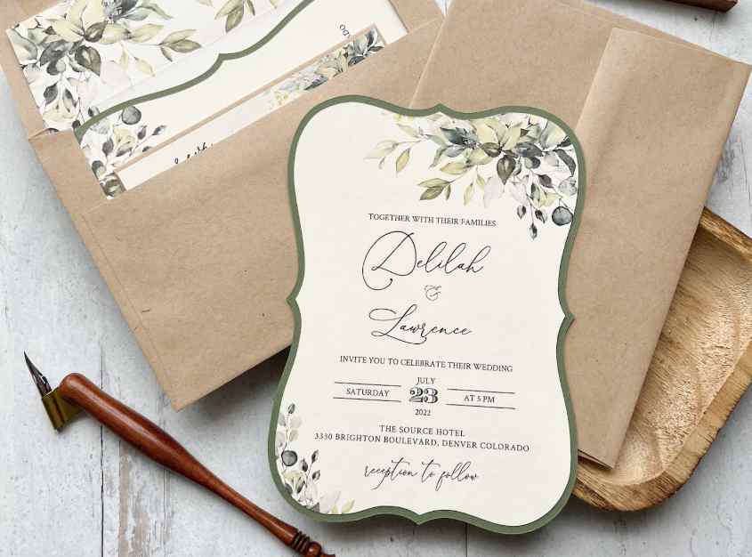
A Beginner’s Guide to Designing Custom Invitations and Specialty Announcement Cards
In an increasingly digital world, physical invitations and custom announcement cards remain unmatched in their ability to convey importance, warmth, and personal touch. Whether planning a corporate milestone, wedding, graduation, or non-profit gala, a tangible print invitation sets the tone for the event. A well-crafted card engages tactile senses through paper texture, weight, print finishes, and color, turning a simple notice into a memorable keepsake.
Designing high-quality invitations requires balancing paper choices, typography, printing techniques, and spatial layout. When exploring custom paper stocks and specialty print finishes, referencing print production guides from paper specialists like AlphaGraphics Crystal Lake provides helpful perspective on how cardstock weights, foil stamping, embossing, and custom envelope folds enhance overall presentation. By following key design and paper selection principles, you can create custom cards that leave a lasting impression.
1. Choosing the Right Paper Stock and Weight
The paper stock selected forms the foundation of any print invitation. Paper weight and surface texture communicate quality before the recipient even reads the text.
Common Invitation Paper Options
- Uncoated Smooth Cardstock: Offers a clean, non-reflective surface that feels natural to the touch. Easy to write on, making it ideal for reply cards and personal notes.
- Coated Silk / Matte Cardstock: Features a subtle surface coating that enhances photo clarity and color vibrancy while minimizing harsh glare.
- Textured Linen Stock: Incorporates a subtle cross-hatched fabric texture, imparting a classic, high-end feel suitable for formal events.
- Cotton Rag Paper: Soft, ultra-premium paper made from cotton fibers. Absorbs ink beautifully and is prized for letterpress printing and formal invitations.
Understanding Paper Weights
Select cardstock weights of at least 100 lb to 130 lb cover (270 to 350 GSM) to ensure the card feels sturdy in hand and resists bending inside envelopes during transit.
2. Elevating Cards with Specialty Print Finishes
Specialty print processes add tactile dimension and visual contrast, transforming flat card designs into elegant pieces.
Card Production Process:
[Layout & Typography] ➔ [Paper Selection] ➔ [Specialty Finishing] ➔ [Assembly & Mailing]
Popular Specialty Finishes
- Foil Stamping: Applies metallic foil (gold, silver, rose gold, or copper) to specific design elements using heat and pressure, creating reflective accents.
- Embossing and Debossing: Creates raised (embossed) or recessed (debossed) three-dimensional impressions on the paper surface without using ink.
- Spot UV Coating: Applies a high-gloss liquid coating to selected areas—such as names or logos—creating a striking contrast against a matte background.
- Die-Cutting: Uses custom cutting blades to create unique rounded corners, arched tops, or intricate lace-like cutout patterns.
3. Typography Rules for Legible Card Design
Selecting clear typography ensures your invitation remains easy to read while maintaining an aesthetic balance.
Key Layout and Font Rules
- Limit Font Families: Use no more than two or three complementary typefaces (e.g., combine a decorative script for names with a clean serif for event details).
- Establish Visual Hierarchy: Feature primary details (such as host names or event titles) in larger, bolder fonts, followed by secondary event details in smaller sizes.
- Maintain Adequate Whitespace: Leave generous margin space around text blocks to prevent the card from feeling crowded or cluttered.
- Check Color Contrast: Ensure text color contrasts strongly against the background paper stock to preserve legibility under soft lighting.
4. Envelope Selection and Mailing Considerations
An invitation presentation is incomplete without a properly sized envelope that complements the card design.
Essential Envelope Factors
- Matching Paper Stocks: Pair invitation envelopes with the same paper color tone and finish as the internal card for a cohesive presentation.
- Envelope Liners: Add a decorative inner paper liner to provide an extra pop of color or pattern when the recipient opens the flap.
- Standard Sizing (A-Sizes): Use standard invitation sizes (such as A7 for 5×7 inch cards or A2 for 4.25×5.5 inch reply cards) to ensure compatibility with postal sorting equipment and standard postage rates.
5. Invitation Card Feature Matrix
| Print Technique | Visual Effect | Texture Feel | Ideal Event Application |
| Digital Flat Print | Smooth, Full Color | Standard Paper | Casual Gatherings, General Notices |
| Foil Stamping | Metallic Reflective | Smooth Metal | Weddings, Gala Milestones |
| Embossing | 3D Raised Surface | Tactile Relief | Corporate Awards, Formal Galas |
| Letterpress | Recessed Impression | Deep Tactile | High-End Personal Announcements |
By selecting quality paper stocks, applying complementary print finishes, and maintaining clean typography layout standards, you can create custom invitations that set a polished tone for any occasion.
